A Look Into the Process
This piece was designed to merge retro influence with a touch of luxury, while staying true to Lookin’s signature style. The autumn leaves bring in the seasonal theme, adding movement and warmth to the composition. Shadows were carefully used to create depth and separation from the background, allowing the central focus "the sunglasses" to stand out boldly. At its core, the design captures a balance between artistry and brand identity, with the speed video offering a behind-the-scenes glimpse into how the vision came to life.
Taking a Look Into the Process Further
The result is a sequence that captivates: highlighting the versatility of the frames while evoking a retro, high-fashion aesthetic. The visuals then transition seamlessly into a full model face over the mannequin, before shifting to a forest setup with autumn leaves in motion—tying back into the seasonal theme. Throughout, the sunglasses anchor the story, representing exclusivity, fun, and timeless taste.
This work brings together image editing, AI image generation, start-and-stop frame sequences, and video editing. The outcome is a polished high-end marketing piece for Lookin - positioning the brand as innovative
Designing Freedom
This piece was built around a single idea, freedom. The plane becomes the centerpiece, a universal symbol of movement and limitless horizons. To frame it, I used a grid of imagery that brings together snapshots of travel, lifestyle, and discovery. Each destination feeding into the viewer’s sense of adventure. The layout draws the eye toward the aircraft, anchoring the message of global mobility while keeping the tone aspirational rather than transactional. Instead of pushing a visa as a product, the design sells a feeling the promise of access, opportunity, and a world without borders.
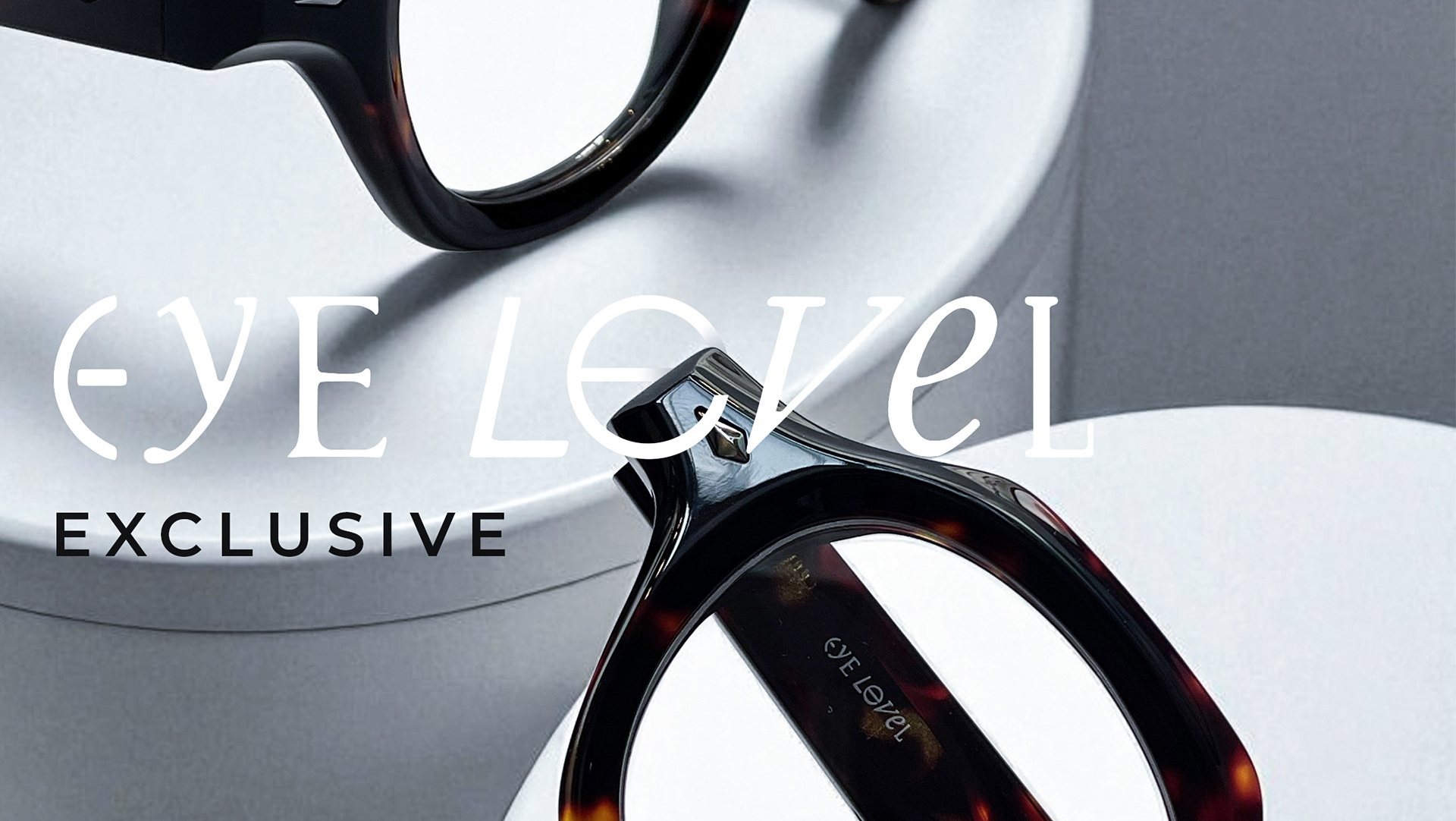
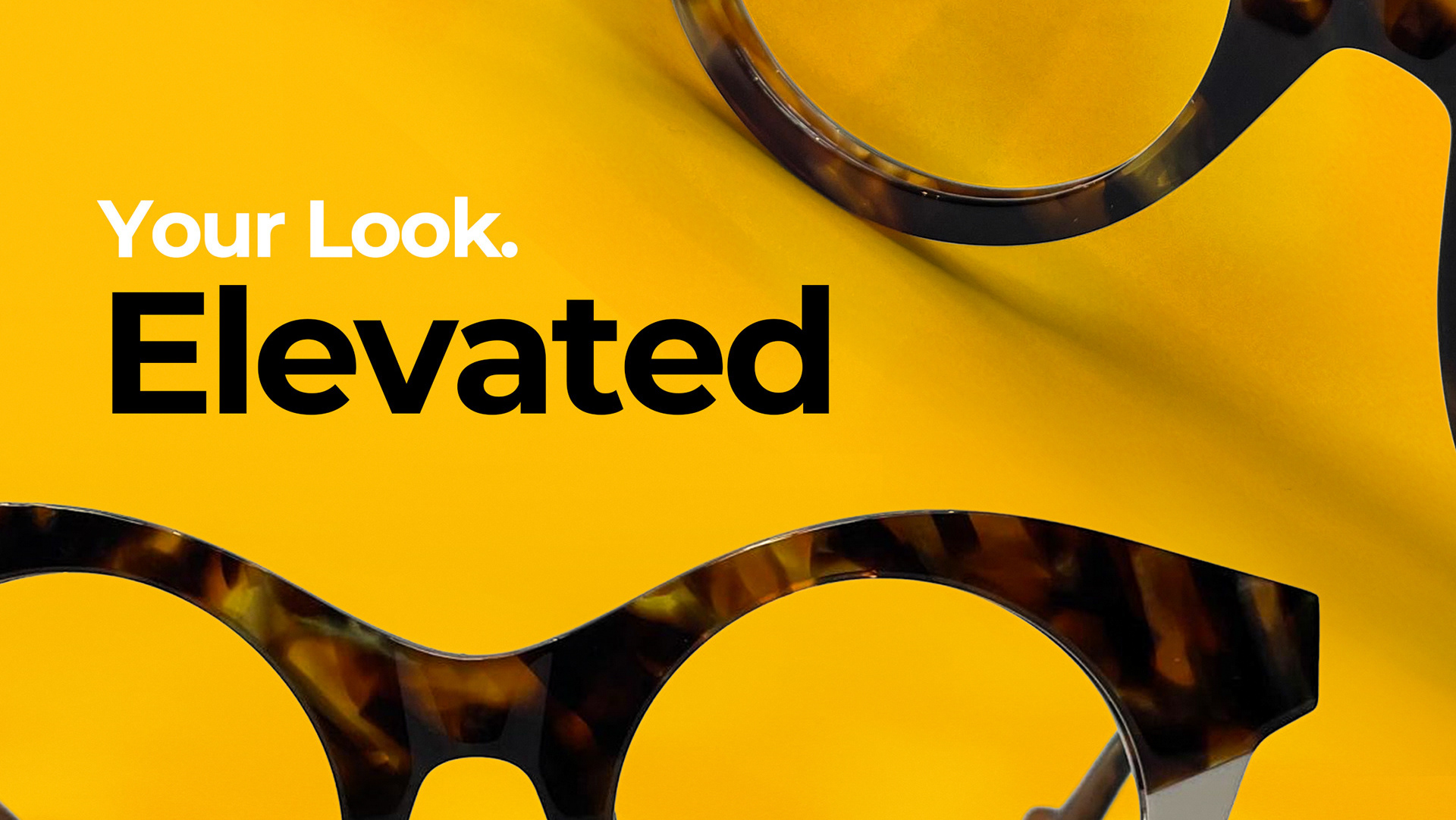
From Mobile to Studio
This design began with a simple mobile shot, transformed into a bold, on-brand visual. By enhancing exposure and applying subtle dodge and burn, the frames were brought to life. Each one catching light in a way that emphasizes shape, texture, and color. The vibrant yellow backdrop injects energy while reinforcing Eye Level’s distinct brand identity. To complete the piece, the Eye Level logo was woven around the composition, creating the sense of a curated “House of Eye Level” selection, where every frame feels part of a larger story.