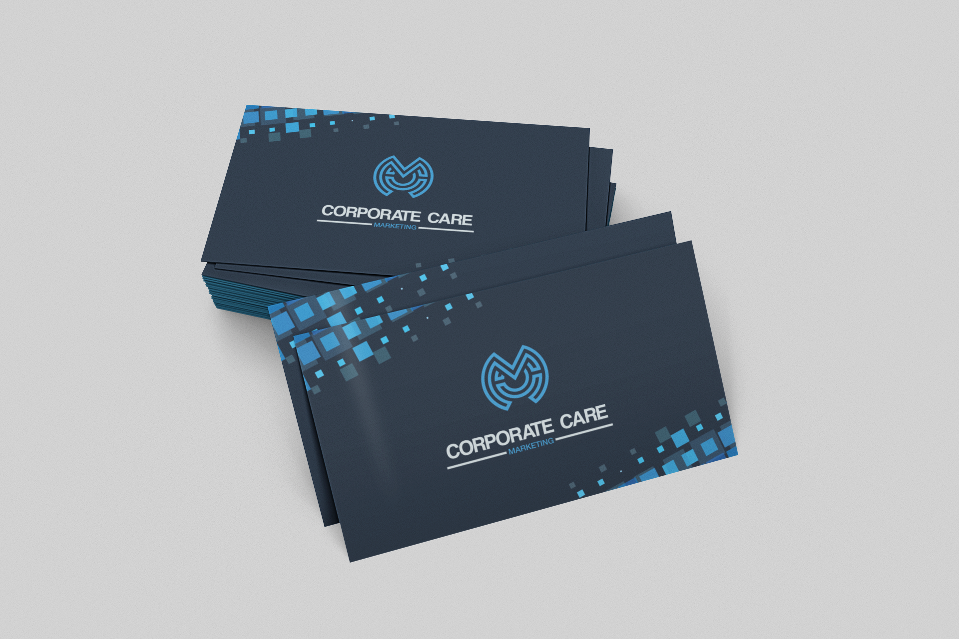
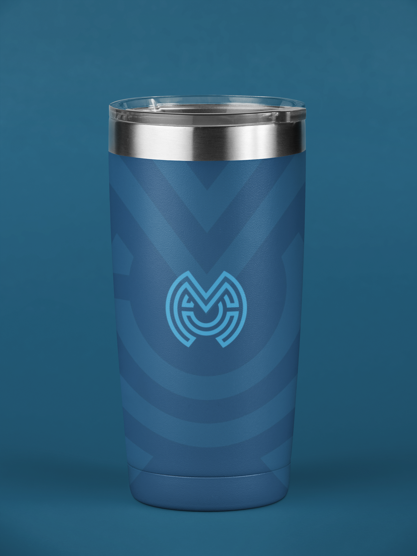
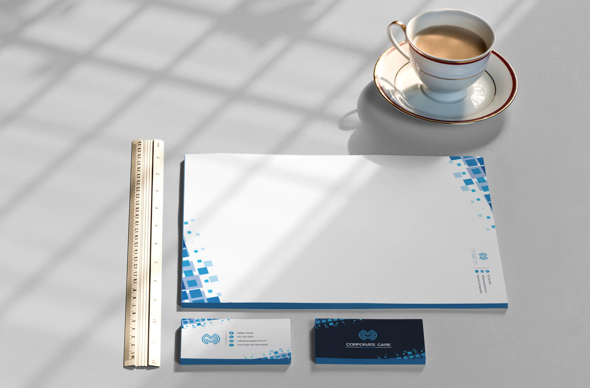
Logo design for a corporate gifting startup. The client wanted a refined monogram style, so I created a mark that subtly weaves together a double C and an M. The single-line structure with equal spacing keeps the design balanced, minimal, and visually pleasing - perfectly suited to a professional yet elegant brand identity.


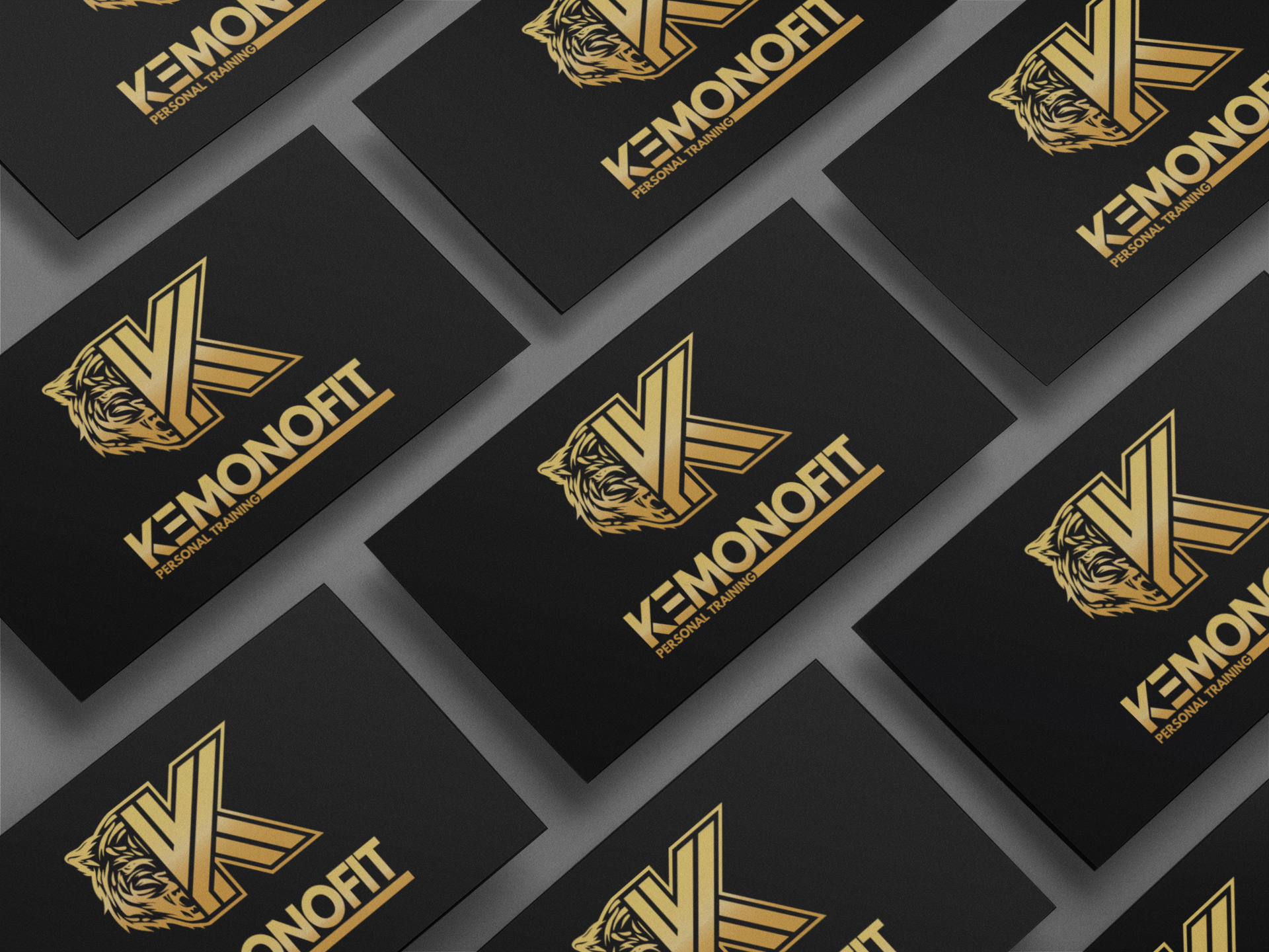
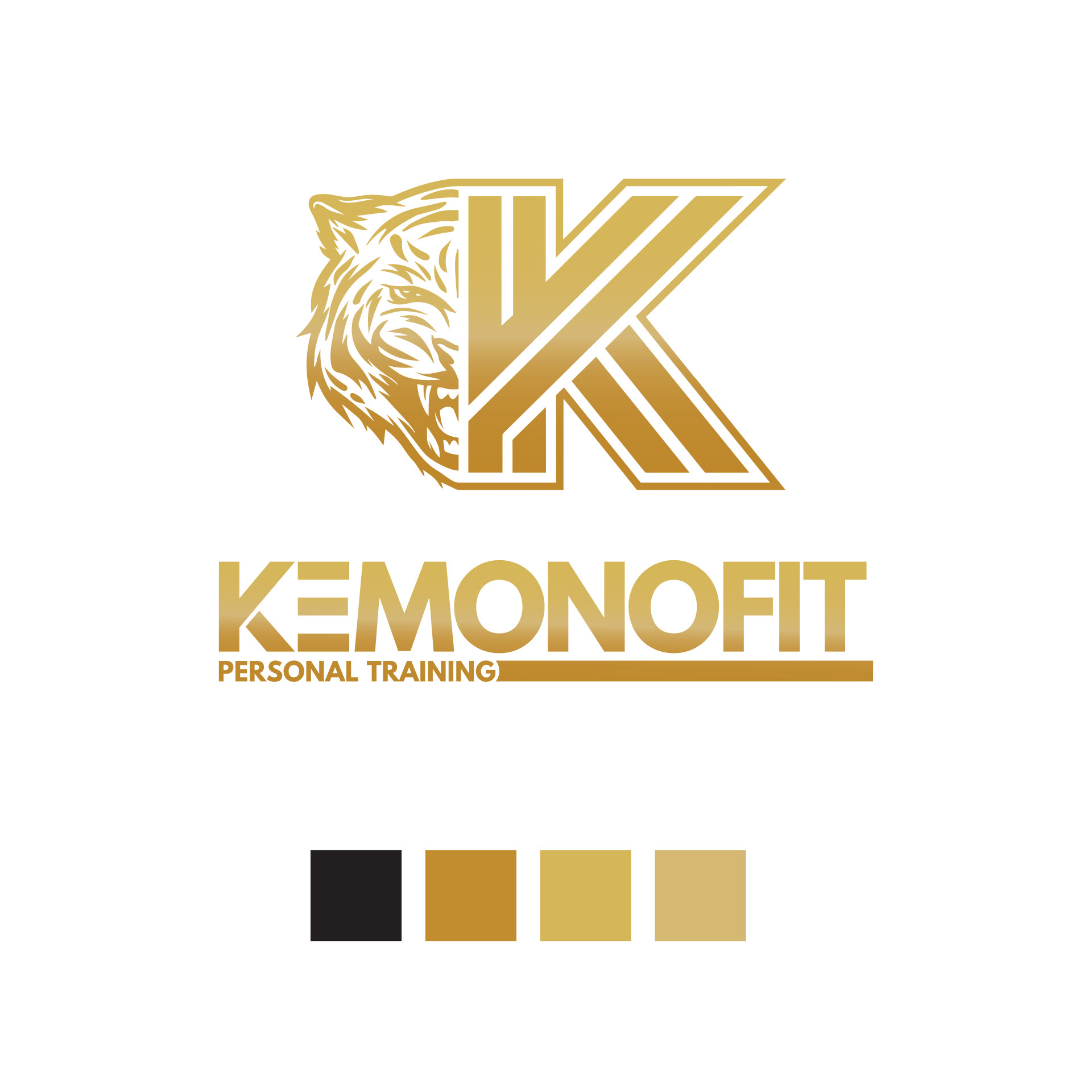
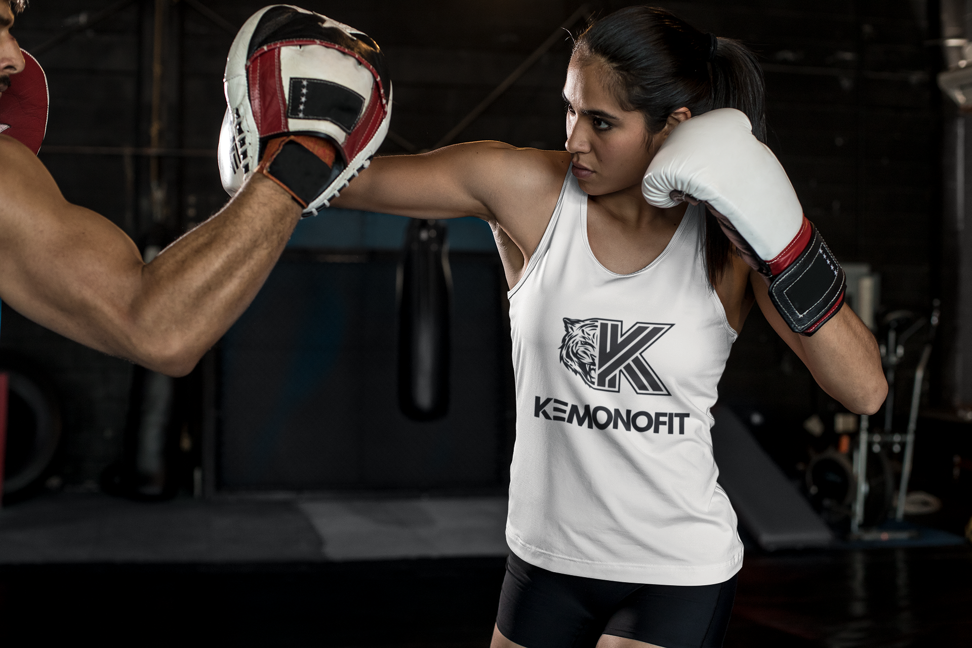
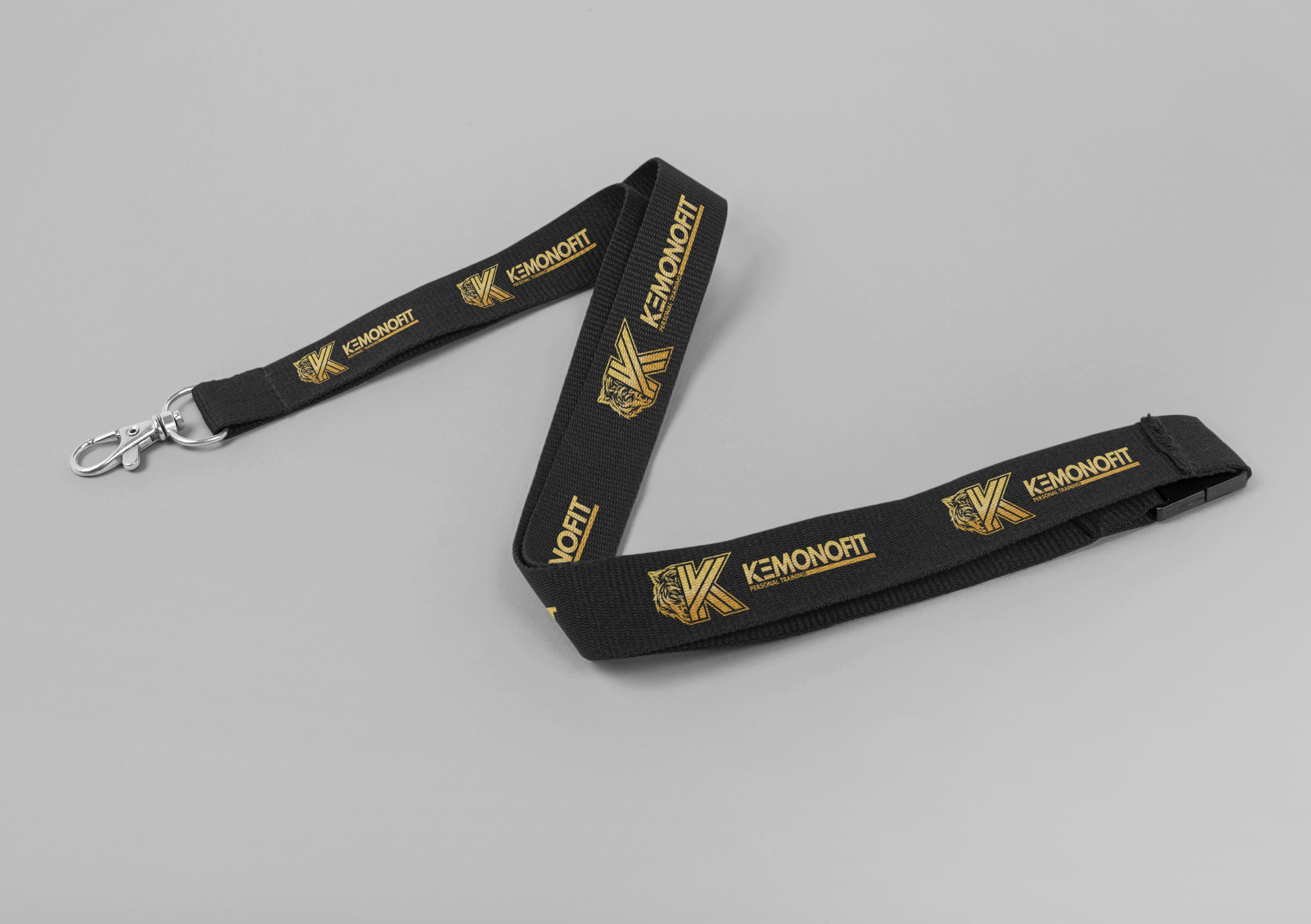
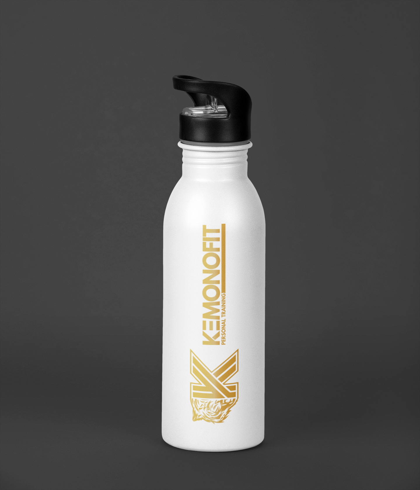
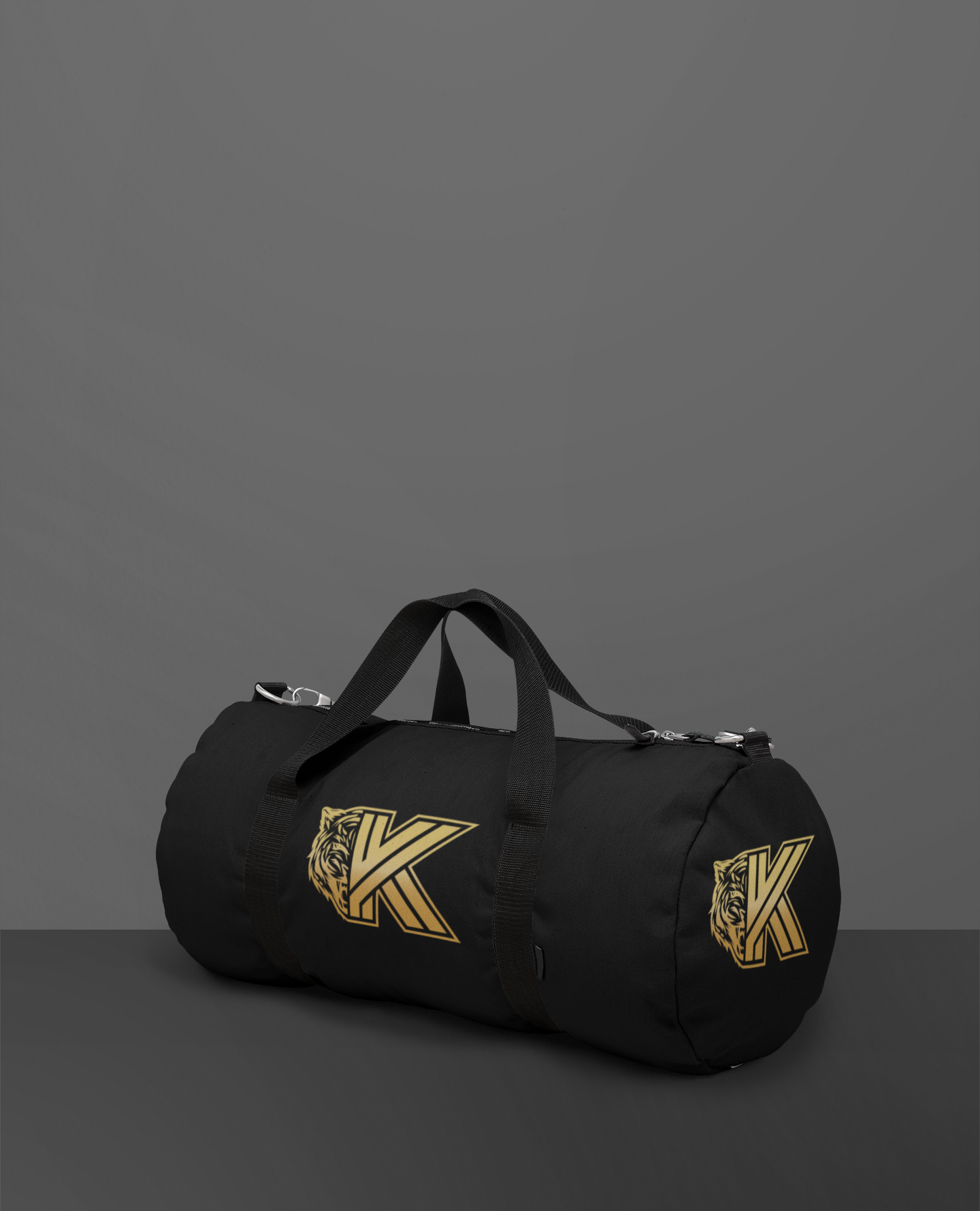
Logo design for a personal trainer’s brand. The goal was to create a bold monogram with attitude - something versatile enough to work on gym apparel while feeling like a strong, standalone brand. A key request was to incorporate a tiger’s face, which I integrated into the design around the K. Balanced spacing and subtle gradients tie the monogram and tiger motif together, giving the logo power, precision, and personality.